Logo redesign
Case Study
kumon
KUMON is the world’s largest after-school learning program that goes beyond tutoring. It focuses on maximizing students’ learning ability. The KUMON METHOD is now available in over 50 countries around the world.
Details
Prepared for IMC580: Portfolio Design class at the University of West Alabama.
Categories
Logo Design
Branding
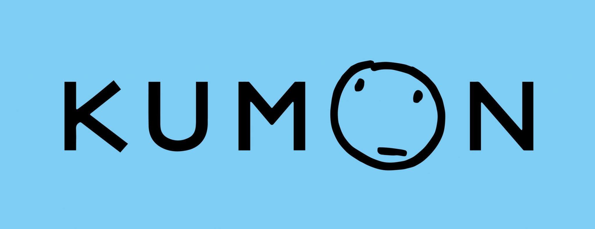
Current logo
KUMON blue
Represents intelligence, honesty, and the sky that stretches across the world.
“Thinking Face”
Represents the faces of KUMON students and instructors.
Redesign Process
Identifying the Problem
KUMON “Thinking Face” is often referred to as “angry face”, which can lead to a negative impression.
Listing Keywords
education, worldwide, children, teachers, world peace, learning, growth, sky, intelligence.
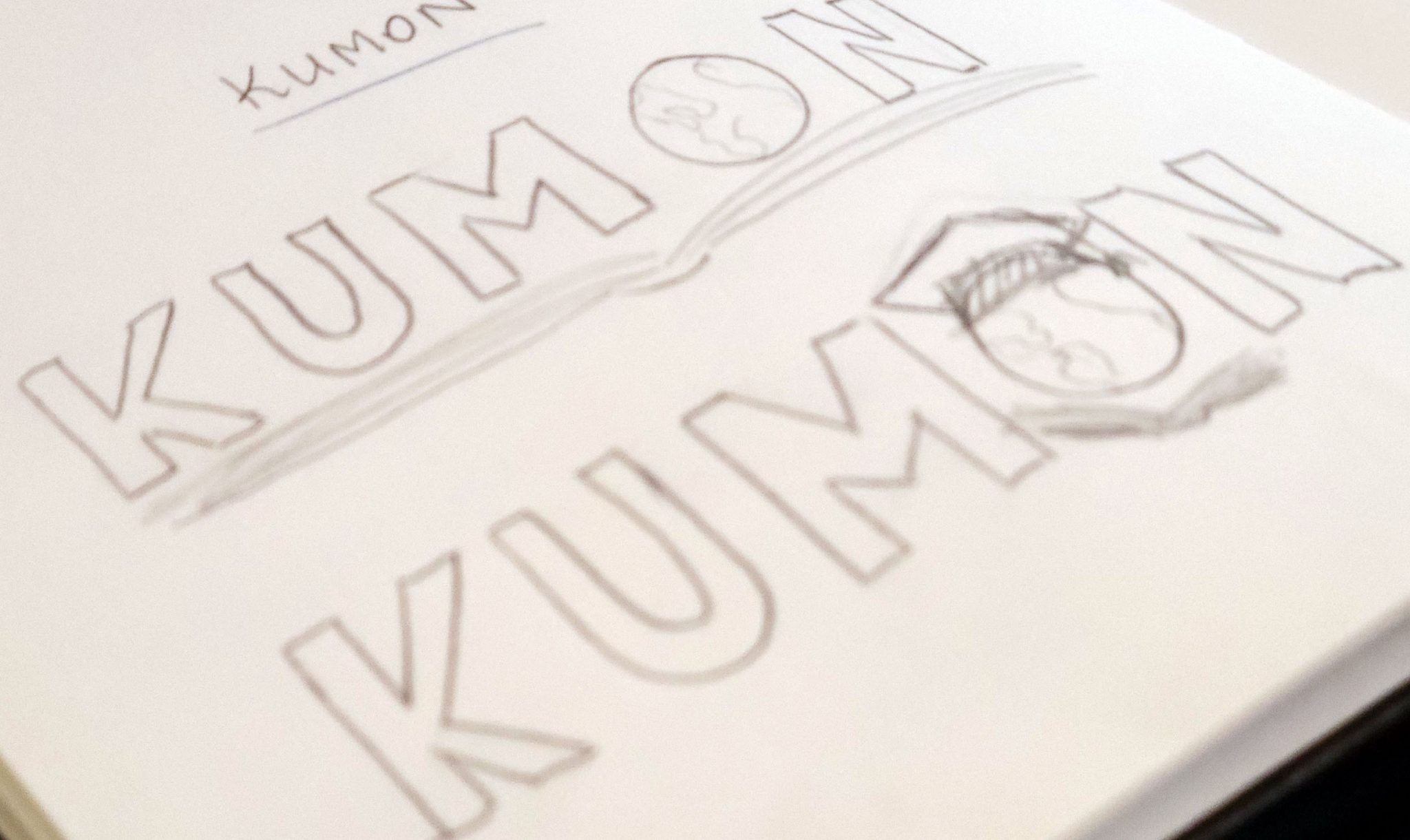
Sketching

Solution
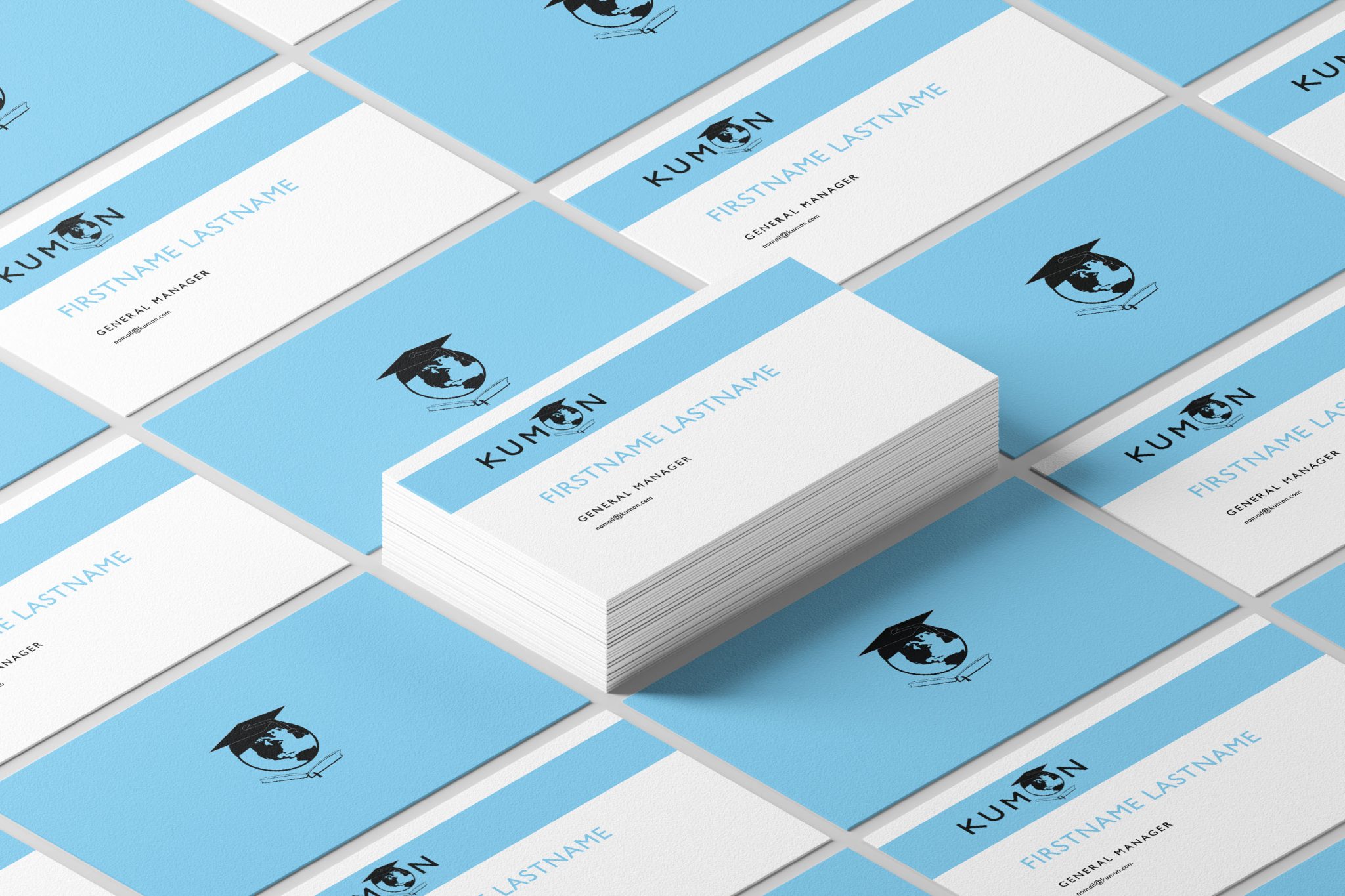
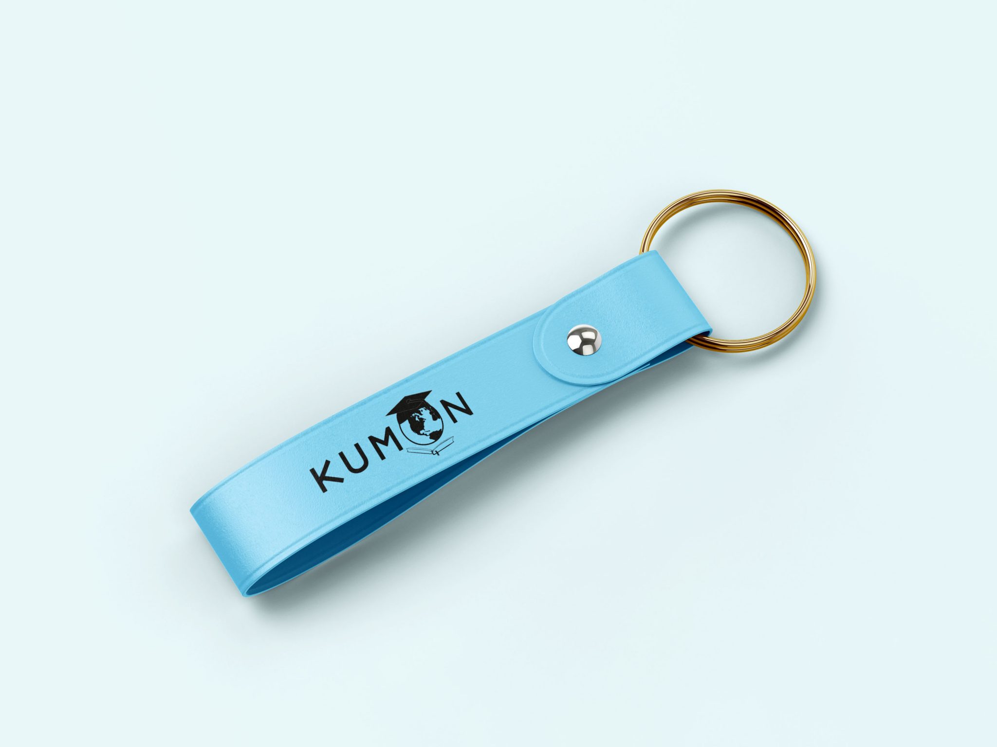
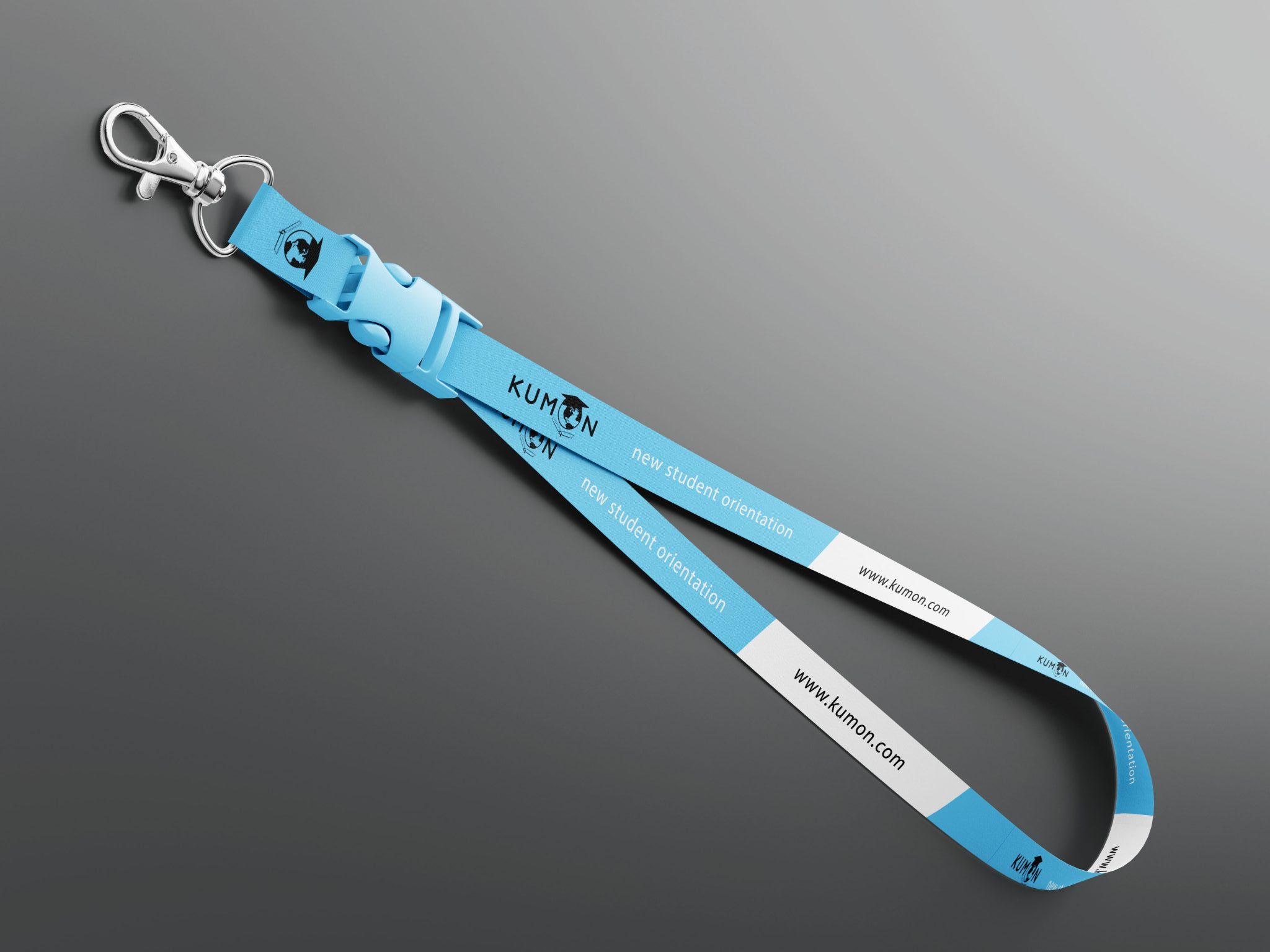
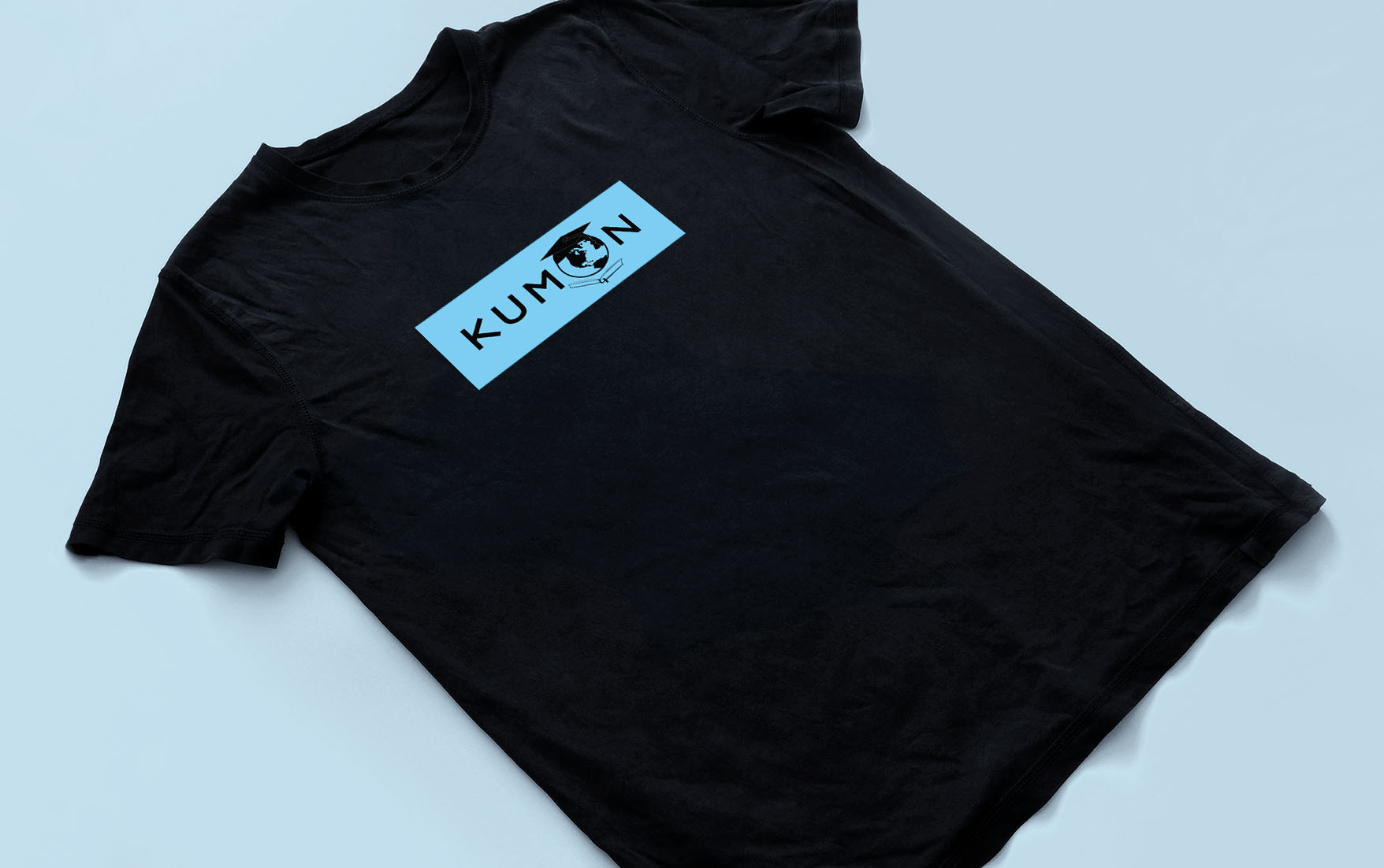
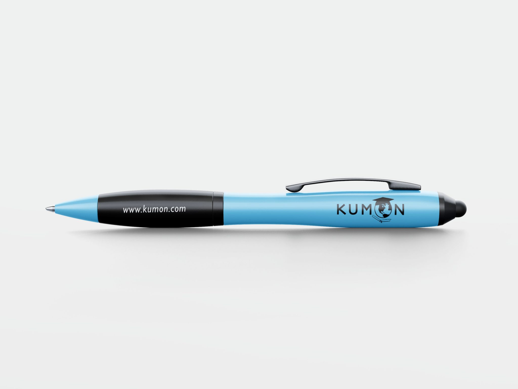
Replacing “Thinking Face” with a new icon: World in graduation cap leaning over an open book.
The new icon placed on a KUMON sky-blue background represents global impact of the KUMON Method as well as equal learning opportunity for children all over the world.
Solution
Replacing “Thinking Face” with a new icon: World in graduation cap leaning over an open book.
The new icon placed on a KUMON sky-blue background represents global impact of the KUMON Method as well as equal learning opportunity for children all over the world.


Other Recent Works

